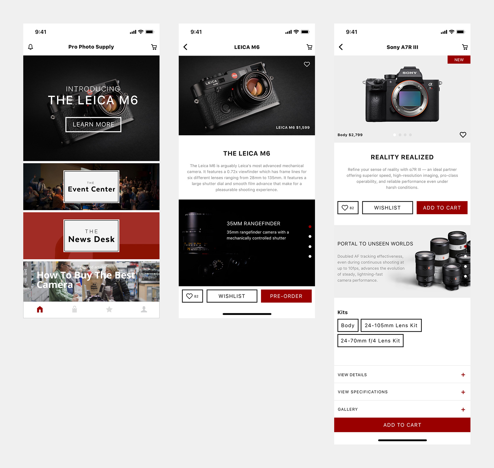
Pro Photo Supply
Lead Designer, In-house
Product Design, UI, UX
In 2013, I joined Pro Photo Supply, a photo specialty retailer in Portland, Ore.
Pro Photo Supply caters to pro's, hobbyists, and entry level photographers. Our staff are not there for a 9-5, they are professional photographers, assistants and videographers - our people set us apart from the Costco's, Best Buys, and Targets.
When I started, the existing website design hadn't been changed in 10+ years. It was built on a 600px grid, wasn't responsive, the largest image on the site was 400px wide. Most importantly, the site wasn't useful to visitors and would more often than not lead to drop offs or calls to the store.
Prior to starting Pro Photo Supply was still embracing the nostalgic yellow and red of imaging technology powerhouses such as Kodak. In 2013, it was more remniscent of Ketchup and Mustard. I worked with stakeholders to build trust and develop an empathetic eye to the brand, it's people, the stories, and how we could fit into the future. I found that our people are what set us apart from any of our competitors. In addition to designing a modern and minimal brand identity and style guide stretching across the logo, typography, and signeage - I pushed for us to become more of a lifestyle brand.
It was clear we couldn't compete with our bigbox competitors, so rather than becoming product focused - we made a concsious effort to focus on the stories you could tell with the products, building up the community through events, and bringing our experience and knowledge to a blog-esque section of our page that covered new products, reviews, tips, local artists and groups, events, locations to shoot, and more.
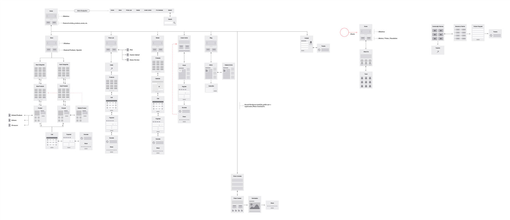
The most important thing we could do was to provide features that improved our customer experience as well our sales associate experience. I worked hard with our rental department to create an online reservation system that allowed customers to reserve equipment and have the reservation get pushed into the pos / rental software; this cut down calls to our rental department by 75%. I partnered with our Photo Lab to build out a ecommerce solution that empowered customers to upload photos and order prints online. I worked with our marketing director to develop an event listing system in wordpress that connected to Facebook and Eventbrite that could handle payments and reservations. Over three years, I partnered with teams across the company to improve customer and associate experiences.
When the site launched our analytics doubled! For the past three months our bounce rate has remained under 4%, down from 50% which held for 3 years, pages per session is at 6 up from 1.3, and time on the site has doubled to 2.5 min!
E-commerce was always a feature I wanted to tackle - unfortunately we didn't have a lot of buy in from stakeholders - some thinking online shopping was still a fad. Inspired by holiday pop up shops - I created a series of online pop up shops showcasing limited products timed around special events and sales. Not only did we make sales across the Pacific Northwest, and the East Coast, we had sales within a half a mile. This was enough to convince our stakeholders to invest $50,000+ into building out our online store.
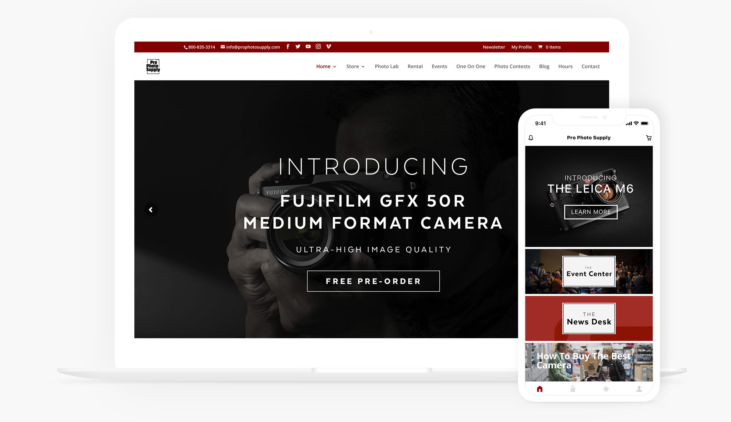
A Full Web Experience
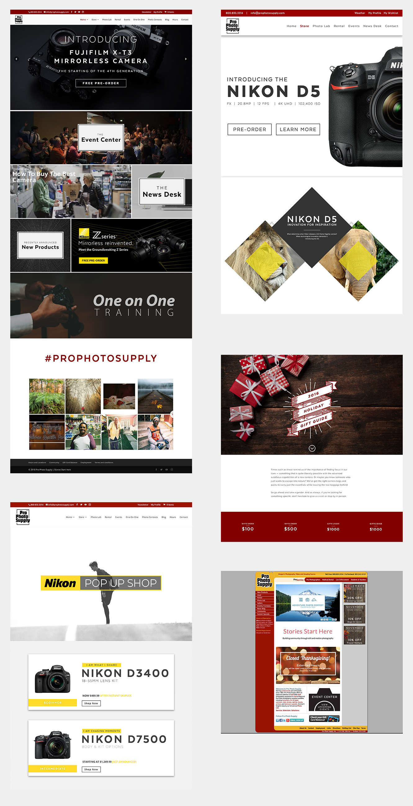
Art Direction and Photography

On The Go
